A recurring problem in the field of web design is scroll hijacking. Here are a few scroll hijacking basics and examples.


User experience and usability concepts are some of the most important talking points for modern web design. Crisp textures and pretty animations do not always make a great website.
The best way to learn web design is by studying UI/UX design first. This gives you a solid framework for interaction design rather than general graphic design(non-interactive).
A recurring problem in the field of web design is scroll hijacking. Whether these designers feel they can work outside UX principles or just like to copy other designers, the result is still exhausting and rather infuriating.
I’d like to cover the basics of scroll hijacking and provide examples for all to see. It’s important to keep in mind that whether you like or dislike a technique is often irrelevant. As a designer you’re paid to deliver whatever best suits the current project, and subsequently the users of that project.
What is Scroll Hijacking?
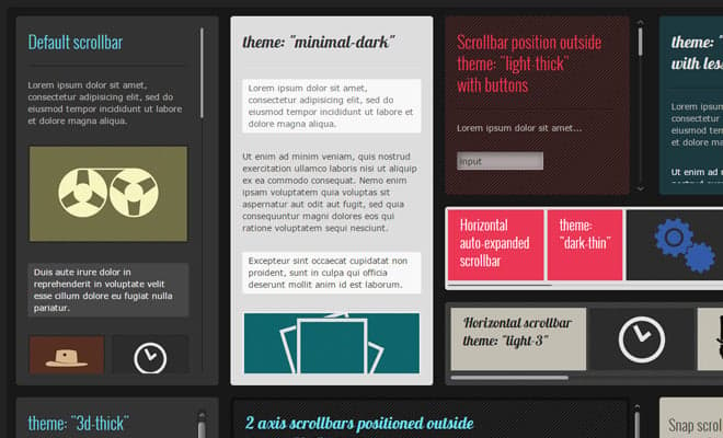
A browser’s scrollbar is defined by standards written into the browser software. The look & feel of the scrollbar may also change based on the operating system (i.e. Windows, Mac, or Linux).
The controversial subject termed “scroll hijacking” is when designers/developers manipulate the scrollbar to behave differently on their website. This can include animated effects, fixed scroll points, and even a redesign of the scrollbar itself.
Scroll hijacking is typically accomplished through JavaScript, so it’s not controlled via the browser or the operating system. The reason hijacking is so controversial is that browser scrollbars belong to the browser window and they’re meant to provide a uniform experience.
Check out the live example at SAGA Web Design.

Their scrollbar has been restyled into a big grey block regardless of browser choice. Also when using the scroll wheel, a horrid animation effect is applied to the scroll.
You’ll notice an exceptionally long-delayed animation that gives the scrollbar a more natural style on par with the way a pulley could work (laws of motion & physics stuff). It seems like a cool idea in theory.
The only problem is that people do not expect their scrollbar to behave this way. In fact, most people don’t even think about the scrollbar because it never changes from website-to-website.
This CodePen snippet illustrates this argument perfectly.
Web designers & developers are given free reign to manipulate anything on the page itself. However, the scrollbar, much like the mouse, should not be considered part of any single website. Most designers follow this rule but the few that don’t cause a perceptible usability nightmare.
The Delicacy of Usability
Humans like to operate on assumptions. The sun has risen every day for my entire life, and I assume it’ll rise tomorrow and all of next week too.
Since we’ve had the Internet for so long most people have developed a similar mindset. A common assumption is that websites generally interact the same way based on a user’s browser settings. Scroll hijacking pulls away this safety net and leaves people confused than satisfied.
And if there’s one emotion that seriously kills usability, it’s confusion.
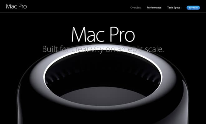
For all the love Apple receives about its design talent, the Mac Pro page uses some detestable scrolling effects. It uses a single-page parallax layout with dots representing each section of the page.
But no matter how much you scroll, the content seems to take on a life of its own. Whether you scroll 1 notch or 5 notches the layout only moves at a predetermined speed.
Since all page content is tied into scrolling, visitors are now limited and forced to browse the Mac Pro site at a slower pace.
Let me state that I’ve seen amazing parallax layouts that perform great – when designed properly. Apple’s Mac Pro site is, in my opinion, one of the worst offenders of bad parallax design & scroll hijacking.

On the DJI website you’ll find another example. The scrollbar doesn’t exactly force a scroll animation but each scroll is slightly limited based on regular mouse movement. So one notch on the scroll wheel is set to move less than the default mouse settings.
Many users probably won’t even notice but on a subconscious level they’ll feel something is different. Usability is very subtle and it comes with a whole bunch of preconceived notions.
Attempting to make everyone accept dynamic scrolling would be as tough as making everyone accept a new “print” icon. Too many people are too accustomed to the way things already work.
Trying to change that is like driving against traffic on the busiest superhighway in the world.
If It Ain’t Broke…
Don’t hijack it!
But seriously, the whole point of this post is to cover scroll hijacking from a usability perspective. The argument isn’t necessarily that scroll animations look crappy. It also doesn’t matter if custom scroll bars look nice or seem tacky.
Websites are made for users and each design choice should be made to benefit the user.
Traditional scrolling is expected by almost everyone who opens their web browser, just like certain mouse settings are expected every time you boot up your computer.
Hijacking In-Page Elements
Trent Walton feels that hijacking works best if it’s used on an in-page element. So div scrollbars created with jQuery could work to a certain degree of success. The same goes for slideshows, image carousels, and other similar dynamic features.
Take a look at the custom scrollbar plugin for jQuery. This can be applied to any HTML element which contains content. It offers a lot of features and options for customizing the look, feel, and behavior of the inline scrollbar.
You can change the height of content and disable the animation by setting scrollInertia to a value of 0.
This will surely still bother many designers but I feel it’s a reasonable choice. Visitors know what to expect from their browser’s scrollbar – however, they might not have any preconceived notions for a custom photo slideshow.
Exceptions to the Rule
In general scroll hijacking should always be avoided. Mostly all examples are horrendous and you’d be better off just giving visitors exactly what they expect.
The only time it’s somewhat acceptable is within parallax design. But you still need to create a scroll experience that benefits the user and the parallax content.
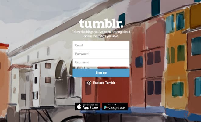
I can’t exactly defend scroll hijacking because it seems like a crime against users. But Tumblr’s homepage uses a form of scroll hijacking which scrolls through fixed panels in the layout. So one scroll notch moves down a full panel that adapts to the full height of the browser window.
Since content is blocked at 100% height and the animation is somewhat quick, this example doesn’t bother me as much. I’d bet many designers will disagree and feel this example is totally unacceptable.
I wouldn’t have a serious counter-argument for that.
But I feel it’s important to note that custom scrolling can be done efficiently, it just requires a very good reason. You also need enough sense to recognize why you’re changing default scroll behavior and how that improves user experience rather than detracts from it.
To wrap up, I’d like to ardently state that scroll hijacking is a big no-no. There are some examples of decent experiences but they’re so few-and-far between that you’re better off not even trying to replicate anything at all. If you can empathize with your average web surfer then you’ll have a much easier time making influential UX decisions.