We cover an assortment of modern trends in creative portfolio website layouts, specifically focusing on those created by graphic designers and web designers.


Working as a creative artist in any field is tough. To succeed it’s imperative that you have a unique voice coupled with a portfolio demonstrating your skills.
These skills could range from websites, print design, icons, mobile apps, vectors, animation… the list is as bottomless as an all-you-can-eat buffet. And much like visiting a buffet, your clients want to work with someone who’s going to deliver above and beyond their expectations.
The best way to prove yourself to a suspecting client is through your portfolio. Back before the Internet was super radical and cool, most portfolios were shown as physical pieces of work.
Nowadays you can show off your work using a great website which can also include some personal information and contact details. Your online portfolio can be seen as an extension of your work that helps sell your talents to prospective buyers.
In this article I cover an assortment of modern trends in creative portfolio website layouts, specifically focussing on graphic designers and web designers. The beauty of an online portfolio is that you get a chance to showcase your creativity and your work, allowing people to view from any device with an Internet connection. But instead of just throwing various platters into your buffet table why not take a more constructive approach?
These trends should offer a durable framework of ideas that you can blend to see how they’d fit into your own portfolio website.
01. Accessible Work Samples
It is crucial that I overstate the importance of your work samples. Make sure you have some good samples and you better make sure they’re easy to browse. If not then the UX monster will come and eat you… or worse, clients will just leave your site without a second thought. Presentation can be just as important as the work itself. When in doubt, simplify.
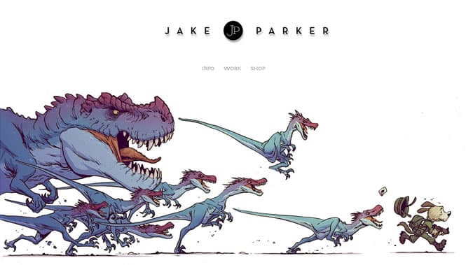
A great example of simplicity can be found in the portfolio of Jake Parker. His portfolio includes a wide variety of content like book covers, graphic novels, and visual development artwork. The homepage doesn’t include much content and the only 3 links available make navigation pretty simple. Clicking through his work leads to single-page items along with multi-paged content rotators.
How you choose to display content depends on how much work you’ve created so far. Every designer will display their work differently but visitors only want one unified experience – to see what you can do in the most efficient manner possible.
02. Single-Page Designs
Don’t think of a single-page portfolio as an implication that a web or graphic designer hasn’t done much work and therefore only needs one page. I’ve seen plenty of single-page sites with dozens of work samples and multi-page sites with only a few samples. The primary benefit of using one page is to remove HTTP requests and make the browsing experience smoother and faster.
This works best if you don’t need to include lots of extra details on each project. Many designers like to include which skills were used on a project, how long it took, or even additional screenshots. This is perfectly fine and certainly looks good to clients but may require more than just a lone page.
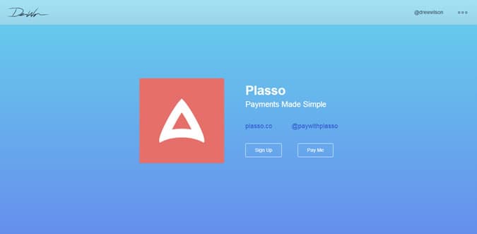
One of the coolest single-page designs I’ve ever seen has come from Drew Wilson’s portfolio. He’s a talented dude who’s created a lot of different startups and applications. His website is split into horizontal sections with different backgrounds for each project. Towards the bottom of his portfolio he lists a timeline of projects with links out to the live websites.
Although this is a more pristine example you might be surprised at how many designers prefer to use single-page portfolios. These layouts are a common starting point for new designers who just want to get something online. But single-page portfolios can also be great for experienced designers who want to condense their work into a quick presentation.
03. Full-width Hero Images
If you want to capture attention quickly try building a 100% width hero section. This would span the entirety of the browser window even if your content is centered to a limited width on the page. Some designers choose to add portfolio project screens while others might include a background video or photograph.

Gil Huybrecht uses a fullwidth header, or hero image on his homepage to showcase a photo of himself. This is very common for freelancers because it gives a personal touch to the website. Potential clients often enjoy seeing what you look like or seeing your office workspace. It depends if you can get a good photo of something that would match your website design.
Another option would be to create a custom header background. This could be hand-drawn or digitally created. This is another great method of demonstrating your skills beyond what can be found in your project work.
04. Content Sliders
In the same vein as a fullwidth hero image you might up the ante to include a dynamic content slider. Whether fullwidth or just typical content width, these sliders can provide a quick look at your work samples. Dynamic sliders are the most common and many will rotate through all items in a circular carousel.
Plus if you’re familiar with setting up jQuery plugins you’ll have no problem finding a free open source script for your portfolio.
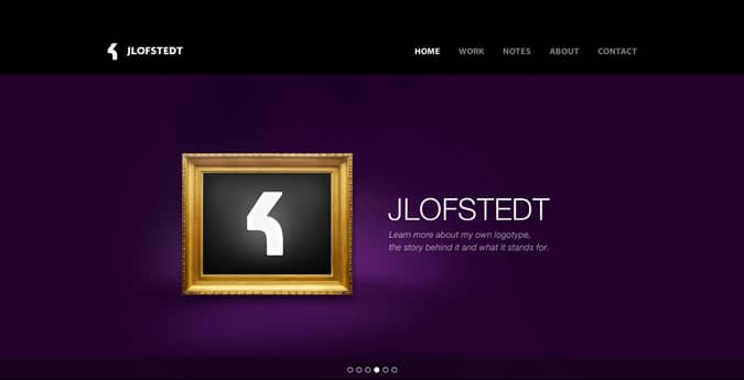
Joachim Löfstedt has a great example on his homepage. Each item in the carousel links to an internal project page with more information and photos. This would be the best way to draw attention to your work. Content is easy to navigate and this slider offers first-time visitors a quick look at Joachim’s greatest projects.
05. Big Readable Typography
Not every portfolio is content-heavy but most are going to need some form of text-based content. Picking the right fonts can be a tough call because you need to gauge how they look in comparison to other page content. I’ve found the easiest solution is to make your fonts bigger rather than smaller – weed out fonts that don’t fit and replace with better options.
Small fonts have their place in layouts where content has been designed to fit into tight spaces. But not everyone enjoys this style because it’s often harder to read. Plus someone who’s quickly browsing your site may completely miss the content if it’s too small to notice.
Yet huge oversized fonts aren’t always the best choice either – try to strike a general balance with more weight leaning towards larger font sizes. You have an extra scales of justice lying around right?
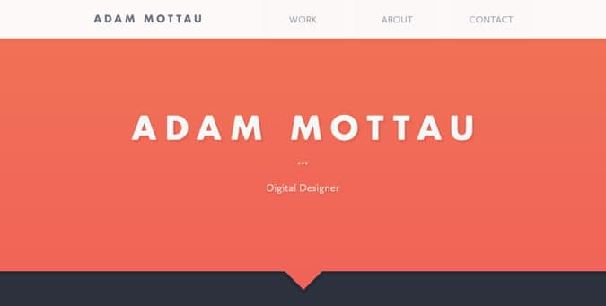
The portfolio of Adam Mottau demonstrates this balance eloquently. His name/logo and the page headers are typically much bolder and larger while content and navigation links are a bit smaller. But none of the text on his site is “too small” in my opinion. Actually the font sizes could even be increased without any negative effects on the composition.
Notice how elements on his portfolio utilize a lot of negative space. Since he’s using a single-page layout the extra space helps to distinguish between content areas. But it also leaves room for typography to breathe without cramming it all together.
06. Attaining Focus
Possibly one of the more important trends to consider is a careful attention to detail. This idea spans all layout styles because focus is needed to keep attention where you want it. Everyone has some level of focus and it’s up to you to channel that focus appropriately. Think about your design not just from a designer’s perspective, but from a user’s perspective. How usable is your portfolio to a non-technical small business owner?
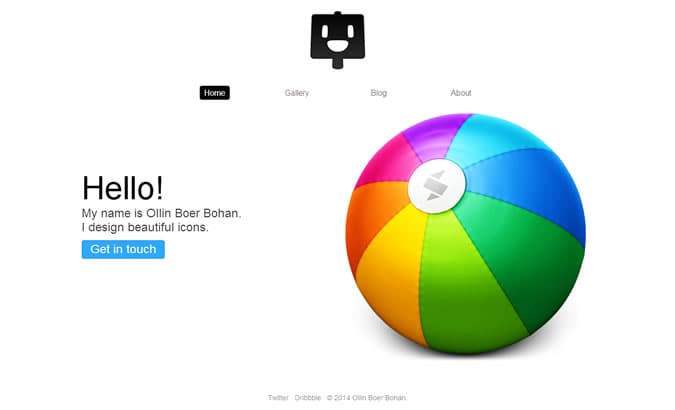
Ollin is an exceptionally talented icon designer with a lot of great work online. His portfolio is minimalist, clean, simple, and definitely performs well on any device. The focus on this portfolio always sticks to his work, or in the case of his blog it sticks to his writing. There’s nothing else distracting you and there’s no way to veer off the intended path.
By using Ollin’s website as an example I don’t mean that every portfolio should be this simple. However his site is perfect for demonstrating how to keep focus on what you want. Depending on the page you might not always want focus to be directed onto your portfolio work.
It’s more important to ask yourself why you want focus on something and how you can achieve that. Usability should always take priority over aesthetic ornamentation.