We take a look at the lesser discussed subject of admin dashboard design trends with examples from quality UI designers.


Most web dashboards are pre-built into CMS engines from WordPress to Drupal. But some projects do require a custom admin dashboard, and it’s the designer’s job to craft a beautiful & usable admin interface. But where do you start?
This post covers the lesser-discussed subject of dashboard design trends with examples from quality UI designers. These trends can be your primary guidelines for constructing solid dashboards that offer an effortless user experience.
01. Thin, Clean Layouts
While this trend is rather popular in all areas of web design; dashboards really take the cake. A dashboard is meant to be used by a smaller group of people with a set of specific tasks in mind. These tasks may include checking data, editing content, or updating a profile.
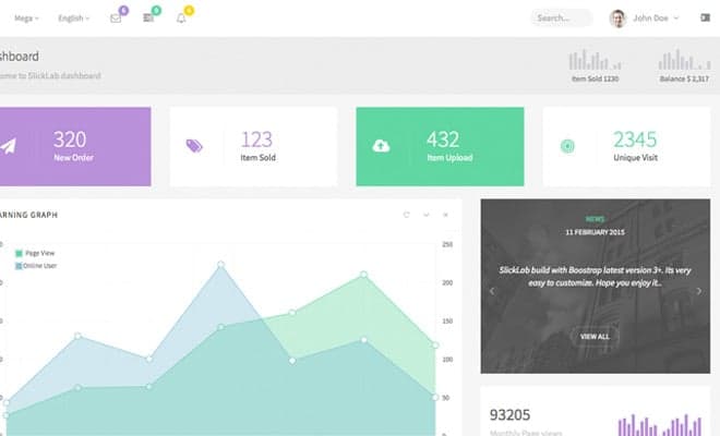
With simple colors and fewer extraneous graphics you place focus right where it belongs: on the content. Simple colors should also be used on areas that require the most attention. Some call this technique “flat design” since it doesn’t rely on textures or repeating patterns to define sections of the page.
Take a look at the above Dribbble shot which follows a very clean design. The header uses the most color with a general gradient moving across the top. All other areas on the page stick with flat colors and basic shapes like squares and rounded corner rectangles.
Notice that typography and content are designed to be front and center. A dashboard should look pretty, but there’s no reason to add extra flamboyance unless it relates to the branding or content.
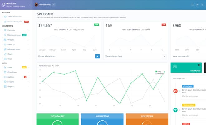
If you’d like to see a live example then take a peek at Pixels which is an Angular admin template. The design follows a traditional black & white color scheme with dashes of color to raise attention.
By focusing more on content & dynamic features the user experience is greatly improved. For example, the line graph includes hover details with points on each line. You can hover almost any chart or data snippet to gather more specific details in a small tooltip.
The lesson here is to keep your dashboard simple. If a certain company requests a heavily branded dashboard, you might include a logo or small icon in the header/footer section. But generally speaking, it’s a good idea to keep smaller branding and bigger content.
02. Icon-Based Navigation
Software applications often use icons to convey a function or meaning. This is why we all know the icons for play/pause in every media player from iTunes to VLC. In a similar vein it’s a good idea to include small icons beside each navigation link.
In the previous section I brought up the trend of minimalist design, and this should carry over into your icons. Don’t make them ostentatious to show off your design abilities. The best icons will blend into the navigation and serve more as guides rather than eye-catching visuals.
The admin dashboard from Zeeshan Riaz is a great example. Each icon is made of a single flat color using basic shapes. Each icon relates to the link that gives users a visual cue to navigate the dashboard.
It’s also nice to see which page is already highlighted with the lighter text & icon style. Other icons fade into the navbar with a darker gray color – dark enough to feel like background pieces yet light enough to recognize what they are.
Another cool example is the Avenxo dashboard design. It also uses mono-colored icons in the style of thin line glyphs. A few links also include bright colored bubbles to indicate notifications.
Interfaces where notification bubbles are most useful are social networks and admin dashboards. Take a closer look at the design and you’ll find thin line icons everywhere.
Some icon links are placed in the upper-right hand corner in the top navbar while other icons are squeezed into rectangular blocks of charts and statistics.
03. User Profile Details
Very few dashboards are made open to the public, so anyone who accesses the backend likely has a personal account. This account may have information that needs to be updated or personal messages awaiting a response.
Although this may seem like an afterthought you have to design dashboards with user profiles in mind. You might include a small link to the profile or you could include further details like inbox messages & alerts.
Slick Dashboard is great with plenty of focus on the content. Notice that user profile links are obvious even though they don’t take up much space. The avatar is a dead giveaway which implies that surrounding links also relate to user settings.
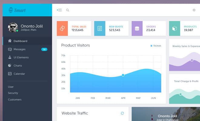
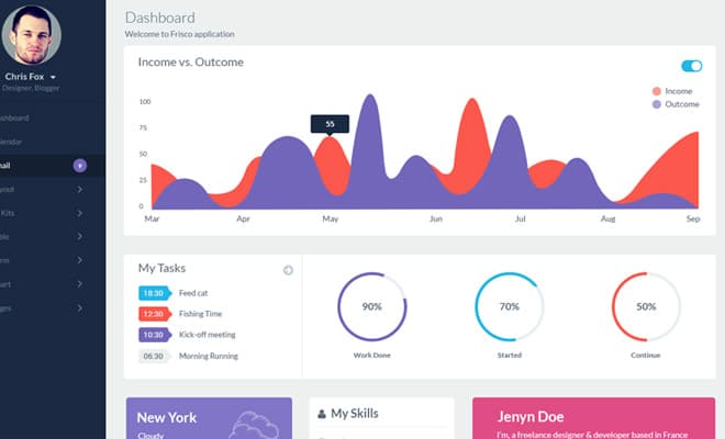
A more interactive example can be found in the Smart Admin Dashboard. A couple icons in the upper-right corner are used for settings and logging out. But the current user’s details are shown right above the main navigation with a profile photo and status indicator likely used for chat/messaging.
This Smart Admin design also follows all other trends mentioned in this post. It runs a clean design style with some great icons that fit into the layout perfectly. Overall it’s a terrific example worthy of emulation.
04. Multi-Column Interfaces
Think of your favorite CMS dashboards from WordPress to Joomla. Most of them work off a multi-column layout because this tends to be easier for the user.
When browsing any website the navigation plays a crucial role, but more so for dashboards. Users often want to jump between different sections from many different pages. A columned navigation can be fixed and even work with sub-links based on the current section of the page.
Columns are also useful for breaking up individual sections of content. Look at this media planner dashboard which uses 3 columns to organize a calendar date.
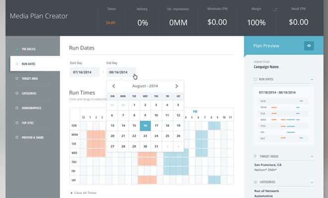
Information flows from left-to-right with left being the most general and right having the most detail. Content is divided structurally and aesthetically using different colored backgrounds.
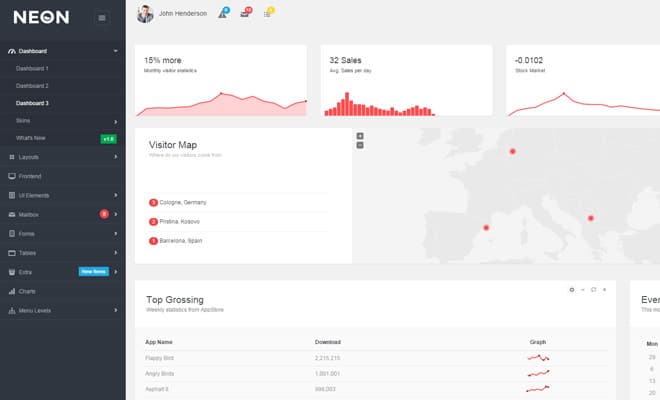
For a live example take a peek at Neon Bootstrap, a dashboard template from ThemeForest. It uses a fully responsive design with sliding navigation links in the sidebar.
Also notice how content on the page often breaks down into a grid. This grid may follow 3 or 4 columns but content might also span the entirety of the page. If you have a lot of graphs or images you can mix these with paragraphs and headlines to build a visual pattern consistent with fixed column design – even for a responsive layout.
05. Data Charts & Graphs
We all know that data & statistics are commonplace in dashboards. The crucial aspect to note here is that data must be relevant and usable. Sticking a bunch of graphs together without visibility or white space does no better than just listing data in a table.
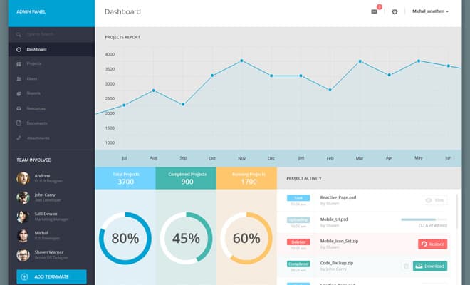
Bucket Admin is a simple template with a lot of data. It relies on a grid/column structure to organize charts individually based on what type of data is shown.
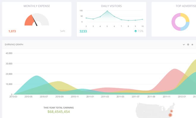
Keep in mind that the live preview is meant to show off everything in the template so it does look a bit cluttered. But notice how valuable information is presented using a series of different methods from sliders, line charts, bar graphs, and live maps.
While these all look fantastic, you shouldn’t rush to build a hodgepodge of graphs just for looks. Graphs are a means to an end for conveying information. When designing an admin dashboard choose graphs that best communicate the data in a concise manner.
Also consider the idea of a quick data summary like in this Dribbble shot by Jamshaid Bhutta. The bottom-left corner houses a series of bar charts for a quick glance of important information. This example relates to a web server which would certainly have important metrics worthy of attention on every page.
Dashboards are not the most common projects but they do serve a real purpose on the web. By understanding which trends are most popular, you’ll internalize how to design and think about dashboards from a UX perspective. From here it becomes much easier to critique, create, and development sensational dashboards from your imagination.