From typography to layouts, what are the biggest web design trends for university and college websites?


Educational sites are often built around hundreds of different pages. Collegiate institutions have to build truly captivating websites in this high-tech era. And just like a business’s website can say a lot about the company, so can the website of a college or university.
The following trends offer a design insight into whether you’re building a custom educational layout or just looking for inspirational ideas. College websites are actually quite unique because their layout styles diverge into many avenues. The best layouts don’t focus solely on aesthetics but instead design with content as a first priority. Traditional design techniques are used for these content-heavy layouts which capture the essence of an institution’s academic goals.
Distinct Page Composition
One of the most notable trends in college websites is the division between content sections. Composition is a huge subject flowing through the whole design into every page.
College websites rely on visually significant elements to break apart pieces of the layout. Headers, carousels, calendar events and blog posts all tend to be organized into their own little blocks. A well-defined composition improves readability which allows visitors to skim content at a brisk pace.
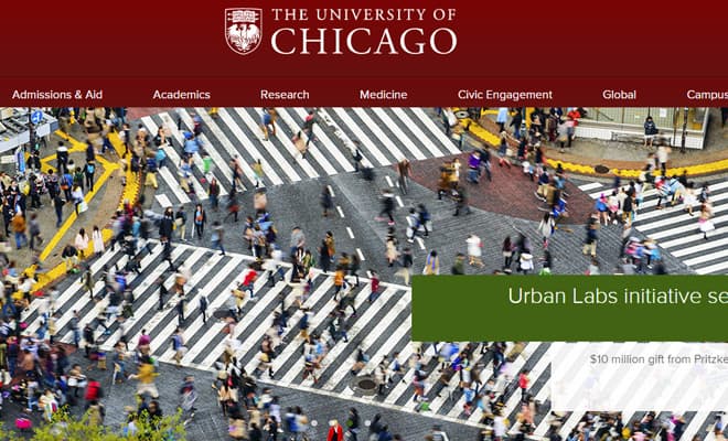
The University of Chicago website is defined by various block elements. Each section uses a fullscreen background color even though content is centered on the page. Header links and dropdown menus also feel like they can be grouped to the navigation visually, which makes traversing content a whole lot easier.
Looking into other internal pages you’ll notice a similar pattern. For example the admissions page uses a sidebar column with links to various related pages. The main content section is broken into headers including other internal links. With so much content it’s vital that users can locate exactly what they need in as expeditious a manner as possible.
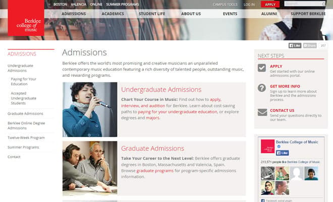
Berklee College of Music has a more free-flowing design, but follows many of the same patterns. From header to footer you’ll notice visual cues which break up the page into distinct sections.
Internal pages on Berklee’s site also use a column-style design. The top navigation has dozens of links with sub-links and these pages are all quickly accessible. By maintaining focus on individual page elements the design runs quite smooth and efficiently.
I also love that Berklee’s website is fully responsive and still looks phenomenal on smaller screens. Responsive design can be tough when you’re working with a content-heavy layout, and Berklee has done an excellent job maintaining a recognizable yet uncluttered composition.
Photo Slideshows & Carousels
What college would be complete without showcasing the school in action? Photos are easily the most popular choice because they demonstrate the campus in a natural light. Prospective students can see the environment and catch a small glimpse of college life.
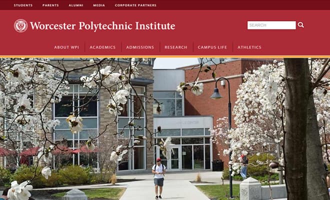
Worcester Polytechnic Institute uses a fullscreen carousel which rotates between different slides. The content is actually mixed with photos and even a small introductory video. High-resolution photos are a must in order to express the full clarity of what a university has to offer.
WPI’s carousel on the homepage also includes bits of explanatory text. Links can be found alongside blocks of text leading to school news, recent events, and important deadlines. Their layout is also responsive and the carousel fully supports touchscreen devices.
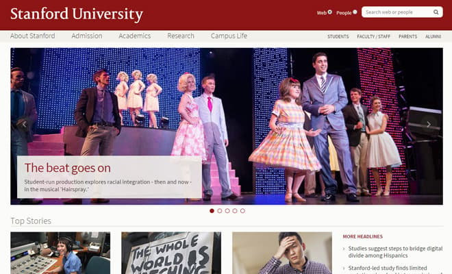
The image rotator on Stanford’s website is a little more traditional. It uses the small circular dot navigation elements for transitioning between slides. Each photo also links to a news item covering details about events at the school. The best image carousels are not just pretty but also serve a purpose for driving people deeper into the site.
Clear Typographic Structure
Since content is a large part of educational websites then it stands to reason typography would be just as important. What good is a lot of text if it’s unreadable?
But typographic design for the web goes beyond just readability. Page structure and content hierarchy should define which pieces of content go together. This trend relates back to definitive page composition but on a smaller scale related to headers and paragraphs.
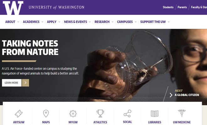
Although there are many examples out there, University of Washington’ website represents a brilliant understanding of structured typography. Page text is heavily contrasted against all backgrounds whether dark or light. Link hover effects are clearly noticeable and provide a soothing user experience.
Moving beyond the homepage you’ll notice that inner page text is also crisp and vibrant. Text size is larger and uses plenty of line height for paragraph text. Page headings also stand out and define their hierarchy through CSS styles(H1, H2, etc).
High Content Density
When dealing with a tonne of content it’s best to separate things into smaller pages rather than overwhelm visitors. High content density is where a designer forces a large amount of content into areas of the page. This requires balance and a keen eye for white space in order to maintain readability.
Too much content will be intimidating enough to send visitors running before they’ve even finished the first sentence. But when done properly this design trend can create a sense of natural order from a tempest of seemingly endless webpages.
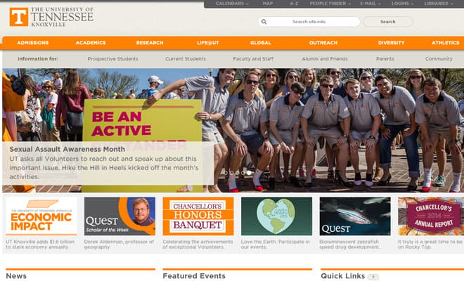
The University of Tennessee layout varies page structure based on the amount of content required. Their homepage includes a content slider along with link columns for news and important information.
Visitors looking to find a particular page will be pleased with their navigation design. It uses primary links along with secondary links for prospective students. Plus there’s a small dark bar of links meant for current students and educators to access features like e-mail. When content can’t be squeezed together it’s best to offer as much navigational freedom as possible.
Individualistic Layouts
Eccentric layout designs are a big trend among various collegiate websites. These layouts still follow typical design rules of composition and content hierarchy, but with a less formal approach to the matter.
Little idiosyncrasies can help the design stand out amongst a sea of familiar layouts.
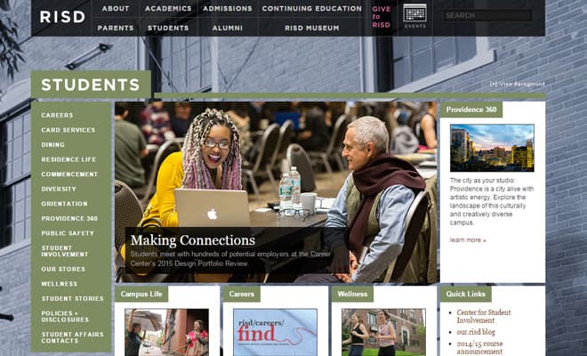
Perhaps my favorite example can be found on the website for Rhode Island School of Design. Since this is a design school it’s not surprising to find out their website is full of ingenuity. Their top navigation uses a blocky-grid design and the homepage is quite simple, yet elegant.
When browsing through the site you’ll notice that most internal pages have a custom background photo. This will span the entirety of the page creating a rich tapestry around the main content. Internal pages also use sub-navigation menu and unique text styles.
Overall, RISD’s website is worthy of attention for it’s unique sense of creativity. Not all educational websites can pull off a layout full of eccentricities, but in most cases, this design style is sure to capture attention.
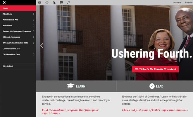
Individualism can also be found in the Clark Atlanta University website. Their layout uses a mixture of horizontal and vertical elements to create a sense of asymmetry. This seems like a bad idea in writing, but in practice their website actually flows well and feels easy to use.
Much of their content is structured into block elements so the layout can adapt naturally. Since the website is fully responsive elements will shift from vertical to horizontal on smaller screens. Plus there are many other previously-mentioned design trends to be found in this site including photo carousels along with a strong content structure.
Learning a new skill or earning a degree is a very big decision. Educational websites are meant to answer every possible question and provide support to past, current, and prospective students. These design trends get to the root of user experience design while also maintaining a consumable method of organized page content. Check out Web Designer Day 2020: Tips From Envato’s UX and UI Designers and Top 10 Free Web Design Courses and Tutorials for more inspiration.